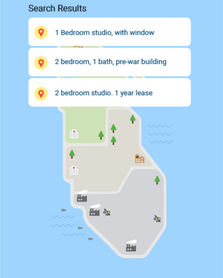
An exhibit piece that invites users to understand internet segregation based on existing racial biases in the society.
Exhibited at: ITP Spring Show 2018, World Maker Faire NYC 2018
My Role: Concept Development, Interaction Design, Physical Computing (Panel design and code)
Collaborators: Asha Veeraswamy, Anthony Bui, Kathy Wu
Timeline: 10 weeks
Tools: Javascript(p5.js, Node.js), Arduino(UNO,MKR1000)
EXHIBIT'S GOAL
-
Encourage visitors to criticize the mainstream view of the internet being equitable.
-
For visitors to feel unfairly forced into an outcome.
-
Confront the scale of internet segregation beyond individual choice.
EXHIBIT SETUP

CONCEPT
1. Tell us about yourself aka set your profile


2. The internet tells you where you should live aka where the algorithm decides your profile should be living


3. Shuffle to play as a random profile
.jpg)

BACKGROUND
This exhibit playfully communicates serious research about internet segregation by Dr.Charlton McllwainThe current architecture of the web encourages categorization. However, this categorization can negatively affect real-world outcomes. In our exhibit piece, we examine the pre-existing, technical, & emergent bias of web traffic segregation. Search Divides Us is an exploration of systemic racial bias through machine learning & tactile interaction.
RESEARCHER
Dr. Charlton McIlwain is Associate Dean for Faculty Development & Diversity, Associate Professor of Media, Culture, and Communication at NYU. His work focuses on the intersections of race, digital media, and racial justice activism. His research reveals how internet's categorizations create opportunities for inequality and more importantly how it has implications on the real world. He was also recently featured in The Atlantic’s The Internet May Be Segregated as a City.
IDEATION
Our interviews with the researcher had a strong take away that the researcher compares web pathways to highways and internet segregation to discrimination in a city. So we wanted our project to have a 'city 'element in it while talking about differences. We ideated a bunch of concepts and presented it to a few of our friends and classmates to see what they interpret out of it and to see if the message was clear. In the initial concepts, we abstracted privilege with shapes and the goal is to find the most diverse neighborhood to live in.


ITERATIONS
After user testing, we found that abstracting inequality wasn't communicating the message of discrimination and segregation. Moreover, it did not make them question about the internet. Some of the questions we asked while reiterating the concept are:
-
How do we force comparison?
-
How to design it so that users are willing to interact more than once?
-
How to make it clear that different profiles end up in different places?
EXPERIENCE MAP

LOW & HI FIDELITY PROTOTYPES
In the initial paper prototypes, we decided to go with direct filters(Income, Race, and Education) on the physical interface that decides where the user should be living on the fictional map. Special attention was given to the color palette and iconography of the map to depict good and bad neighborhoods


INTERACTION DESIGN
Feedback of user action is given in the form of visuals and sound. Neo pixels on the physical interface are used to illustrate the user's selection from the rotary encoder. Each parameter('race', 'education', 'income', 'search' and 'refresh') are color-coded on the physical and digital interfaces for easy recognition. The angled design of the console is inviting and giant sized buttons enable multiple users to interact with the system at the same time encouraging them to discuss. Timings of the interaction have been refined after multiple user tests.
TECHNOLOGY
There are two tech components to this interactive exhibit - Tangible and Digital. The tangible kiosk acts as an input and the visuals on the screen are the output. We used rotary encoders, buttons and a limit switch as inputs to the master MKR1000 which then communicates with the slave Arduino UNO which is connected to the Neopixels. We used a master and slave Arduinos merely because of insufficient pins on the MKR1000. Visuals are created on P5.js using a P5 scene library that talks to the browser using Node. These visuals are projected on a custom map cut on a CNC using projection mapping.

THE TEAM

From left to right: Asha Veeraswamy, Kathy Wu, Keerthana Pareddy(Me), Anthony Bui
